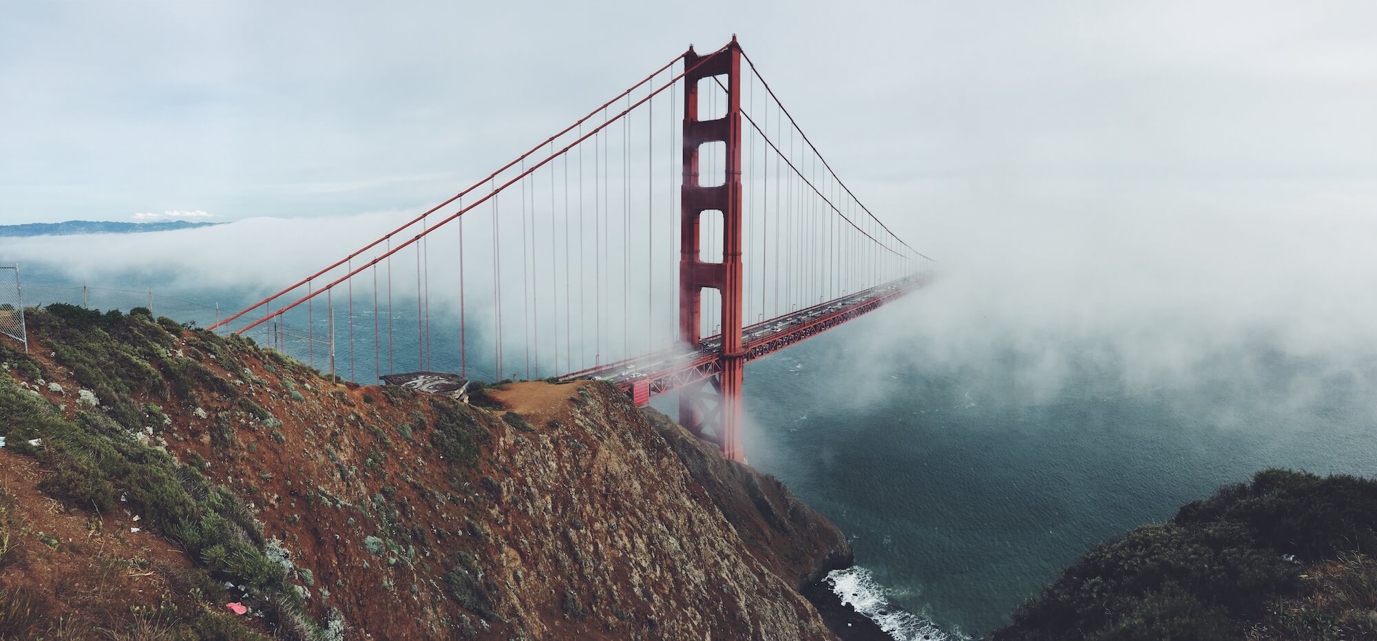
Panels, like Alert Boxes and Callout Boxes before it just add an additional display to present your content in a structured way.
Panels can also use an Image placed at the top or bottom for added appearances.

Featured Top Panel
Donec ullamcorper nulla non metus auctor fringilla. Maecenas sed diam eget risus varius blandit sit amet non magna.
Featured Bottom Panel
Donec ullamcorper nulla non metus auctor fringilla. Maecenas sed diam eget risus varius blandit sit amet non magna.

Options
| Argument | Default | Description |
|---|---|---|
| color | default | Color of panel - default, primary, success, info, warning, danger or any hex value (#0099ff) |
| title | None | Optional text for header title. |
| footer | None | Optional text for the footer. |
| text_align | left | How to align text - left, right, center. |
| image_top | The URL to an image to place at the top of the panel. | |
| image_bottom | The URL to an image to place at the bottom of the panel. | |
| shadow | There are 8 different theme shadows that can be used. -- 1, 2, 3, 4, 5, 6, 7, or 8. | |
| class | None | Any additional CSS classes. |
