Our Themes come bundled with a basic Image Slider and Post Slider powered with a variation of Flexslider. These sliders can be inserted into the featured area, text widgets and the traditional pages and post.
Image Slider
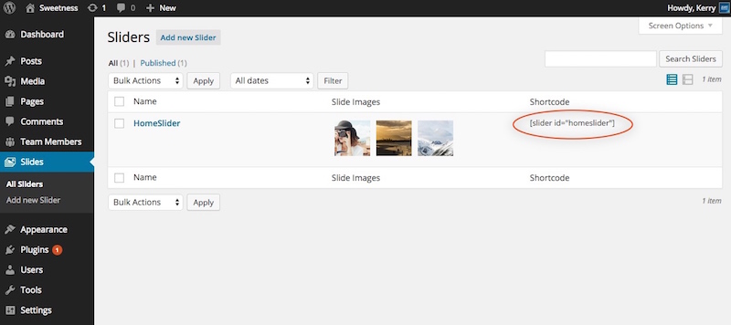
Options
| Argument | Default | Description |
|---|---|---|
| id | the slug name of the slider | |
| shadow | 1 | Add a designed shadow to the bottom of the slider frame - none, 1, 2, 3, 4, 5, 6, 7, or 8 |
| crop | slider-full | The image crop size for each slide. |
| smooth_height | true | true or false - If the images are of different heights, you can set the slider to smooth the transition. |
| class | Add a classname for CSS customizations |
Creating an Image Slider
With our Image Slider, your should use an image sized at 1200x400. Anything larger will be hard cropped to this size.
Slider Settings
In addition to setting your images on the slider, Flexslider provides a few options to adjust the navigation, transition, and speed of each slide.
Post Sliders
In addition to using the built-in slider for images, you can pull in post and display them full size, or have the featured image aligned left or right.
Options
| Argument | Default | Description |
|---|---|---|
| Category | The slug of the category to pull post from | |
| shadow | 1 | Add a designed shadow to the bottom of the slider frame - none, 1, 2, 3, 4, 5, 6, 7, or 8 |
| post | -1 | The number of post to display, use "-1" to display all. |
| image | full | The alignment/size of the featured image - full, alignleft, alignright |
| title | true | Display the post title. - true or false |
| excerpt | true | Display the post excerpt - true or false |
| link | true | Display the post link - true or false |
| nav | true | Display the slider pagination navigation - true or false |
| arrows | true | Display the slider arrow navigation - true or false |
| pause | true | Pause the slider if hovered over - true or false |
| animation | slide | Slide transition - slide or fade |
| speed | 7000 | The speed between each transition in milliseconds. |


