BNE Panels is a WordPress Plugin that adds additional content that pushes in from the edge of your website; triggered by a user action (link, button, image, etc). It’s simple and powerful.
Installation
You can install BNE Panels two ways, either FTP to your server and upload the bne-panels folder to /wp-content/plugins/ OR you can install/upload the zip file, “bne-panels.zip” included within the main file you downloaded.
Uploading/Installing via WordPress:
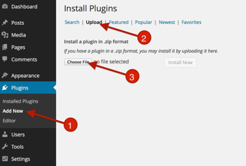
- Go To Plugins > Add New
- Click on Upload
- Click “Choose File” and drag “bne-panels.zip” (This file may be inside your downloaded zip file).
- Active BNE Panels
- Once BNE Panels is installed and activated, a new admin menu item will appear called, “Panels.” That is where you will build and publish each Panel for your website.
Terminology
Panel – The name of the plugin and also the name of the hidden content. In other words, the panel or sidebar that appears from the side of the browser.
Trigger – Any element on the page that is used as an action to display a Panel. The trigger can be a pre-made button or image that is floating on the browser edge or a user defined element from the page (link, image, button, menu item, etc).
Overview
Panels work much the same way as any post or page. Each Panel acts as it’s own post to where you can publish, update, edit, save as a draft, or delete.
- To add a New Panel, go to the Admin Menu > Panels > Add new Panel.
- While creating a Panel you can add any custom content using the WordPress default editor and style the Panel and Trigger to your needs.
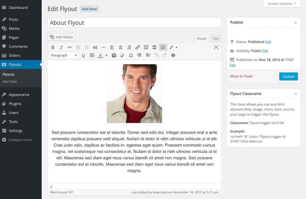
- In addition, this screen shows an example of how to use the “Panel Classname”. This class allows you to also use any element on your page to trigger the Panel such as a menu item, button, image, etc.
Panel Content
At the top is where you will add your content to be displayed when a Panel is open.
- Content Editor - from WordPress. Here you can add any text, images, and most shortcodes to be displayed in this Panel. In addition, you have the options from the Text Editor to use any HTML.
Panel Styles
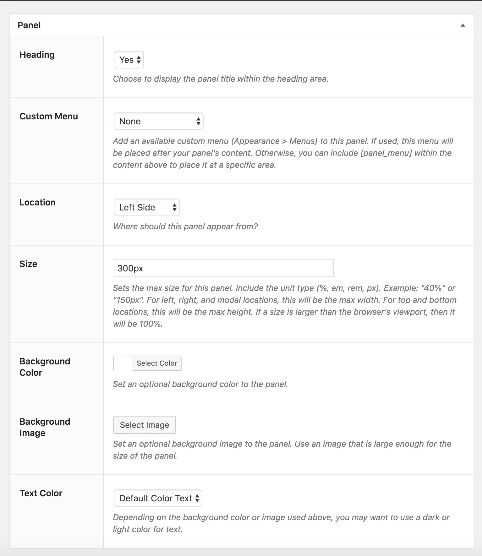 The Panel Options allows you to customize the appearance of the Panel. This includes setting a custom background and adjusting the position, size, and background styles.
- Headings – Display the title at the top of the panel.
- Custom Menu – Display an available Custom Menu from (Appearance > Menus). The menu will be below any content added. If you rather the menu be placed in a certain area use [panel_menu].
- Location – Sets the side the panel will appear from.
- Size - Sets the size of the panel. For Top and Bottom panels this controls the height. Left, Right and modal panels the width.
- Background Color and Image – Sets a background color to the panel and or an image. If using an image, it should support the overall size of the Panel as it is positioned cover.
- Text Color - The general color of the text, default, dark, or light. If using a dark background, you should choose light text.
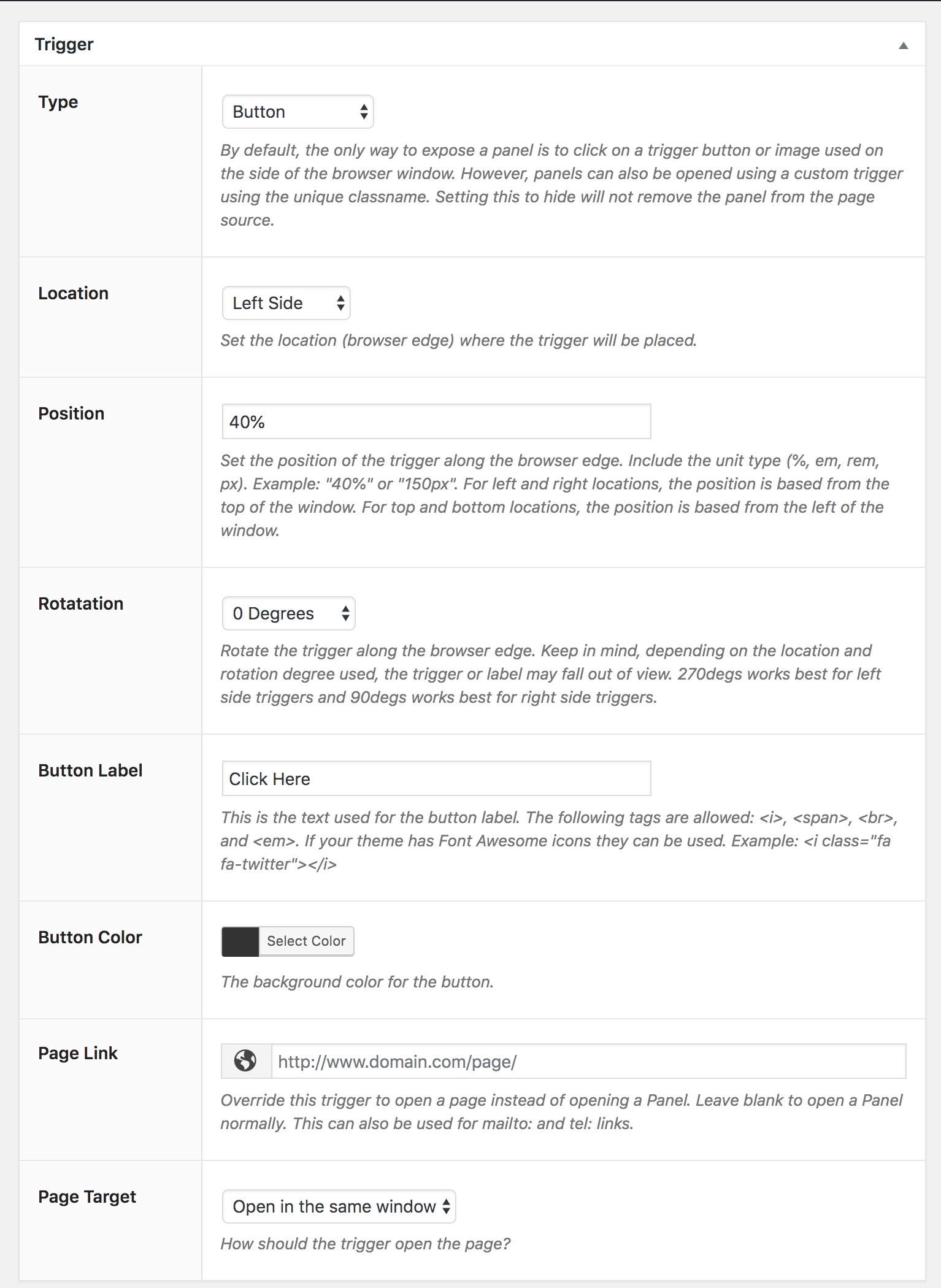
Trigger Settings
 The Trigger Settings section allows you to customize the trigger that is floating on the browser edge. When the user clicks on this, the Panel will appear to the user.
- Type – There are two default types, either a simple button with a text label or an Image. Using the button type allows you to also set the text label and color of the button. The Image type will allow you to upload/set an floating image. In addition, you have the option to select a third setting, “Hide”, which will not display the trigger at all.
- Location – This controls the browser side where the trigger will display at.
- Position – The position where the trigger will be placed. For left and right triggers, this will be positioned starting from the top of the window. For top and bottom triggers, this will be position starting from the left of the window.
- Rotation - This allows you to rotate the button along the browser edge to be flush, or at an angle. Depending on the side use, the rotation may place some or all of the trigger outside of the viewport.
- Button label – (Button Only) Any text value you wish to use as a label. Default is “Click Here”.
- Background Color – (Button Only) Sets a static background color to the button.
- Button Image – (Image Only) Sets an image to be used as the trigger. Left and Right image triggers include a max-width of 200px to help prevent covering too much of your content. Top and bottom triggers use a max-width of 100%.
- Page Link – Let’s you to use the trigger as a page link instead of opening a Panel.
- Page Target – Should the page link open in a new window or same window.
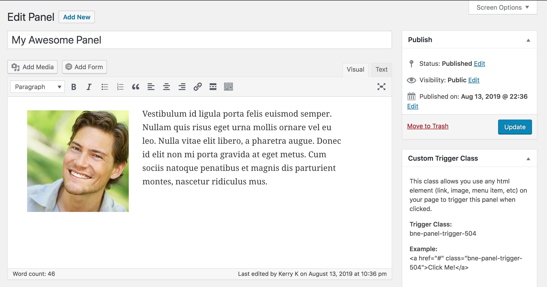
Trigger Classname
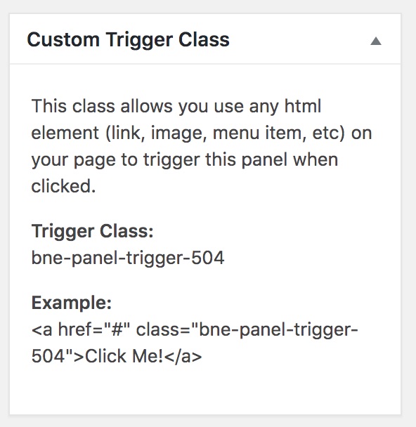 The Class Name is a unique ID given to each Panel. This allows you to use any HTML element from your website page to trigger the Panel by adding the the class name to the element’s HTML markup. The number in the name class is the “post-id” of the Panel.
Using a Text link Example:
<a href="#" class="bne-panel-trigger-37">Click Me!</a>
Using an Image Example:
<img src="url_to_my_image.jpg" class="bne-panel-trigger-37"/>
Use a Menu Item:
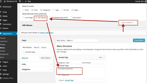 If you are using the built-in WordPress Menu system (Admin Menu > Appearances > Menu), then you can also add the class name to a menu link. Each menu has a entry field, once added to a menu, for class. If you do not see the field, you need to enable it from screen options.
Note: Some Mega Menu plugins actually change the behavior of this class field and may not work in all scenarios.
Developer Tools
With all of our products, we include a few areas to extend or change the default behavior of our plugin. For styles, you of course would use CSS, but if you want to change the behavior or add custom content the below hooks will help you out.
| Name | Type | Arguments | Description |
|---|---|---|---|
| bne_panels_get_post_types | Filter | $post_types | Allows you to extend the available post types in the Page Restriction select area. By default this includes only Pages and Post, but you can extend to other custom post types. $post_types returns an array of post types. |
| bne_panels_restrictions | Filter | $skip, $id, $current_page_id | This is the final catch all restriction filter for anything else you may want to add conditional logic. $skip - Either true or false and is returned at the end. $id - Pulls in the current Panel Post ID. $current_page_id is the queried_object of the main page being viewed. |
| bne_panel_content_before | Action | n/a | Allows custom content/functions to be displayed BEFORE the Panel editor content. |
| bne_panel_content_after | Action | n/a | Allows custom content/functions to be displayed AFTER the Panel editor content. |
| bne_panel_footer | Action | n/a | Allows custom content/functions to be displayed AFTER the Panel content inside bottom div. |