In this article, I’ll show you how to create the classic sticky sidebar. This is useful if you’ve got a simple sidebar with not many widgets, that you’d like to keep the website visitor engaged with as they scroll down the page.
As you probably know, the Sweetness framework already comes equipped with Bootstrap. What you might not know, though, is that Bootstrap has a feature called “Affix” that we can use here. Here’s the full documentation for this feature:
http://getbootstrap.com/javascript/#affix
Now, this method isn’t perfect, but we can make it work. And the beauty here is that we don’t have to include some other big JavaScript or jQuery script for creating this feature, and adding more weight to the load of our website.
Prep: Figuring Out the Numbers
Our first step in this process is to determine some numbers and do some simple math. We need to determine the following pixel values:
- Distance: The initial distance from top of website to first widget.
- Top Position: Position of the sidebar from top of viewport, after user has scrolled down the page and the sidebar sticks.
- Offset: The position in the website where the sidebar will actually stick.
- Sidebar Width (large desktops): The width of the sidebar when the viewport is 1200px or above.
- Sidebar Width (small desktops): The width of the sidebar when the viewport is 992px to 1199px or above.
These values will be different, depending on which theme you’re using and how you’ve set it up.
Distance
This distance can be a little tricky to calculate. — If you’re using your browser’s developer inspector, you may have to add some different elements together. Or for me, I like to cheat; I just take a screenshot, open up in Photoshop, make a selection of the area, and measure it that way. Another way would just be to fudge all the numbers later when we implement the code (but this may take a lot of annoying trial and error).
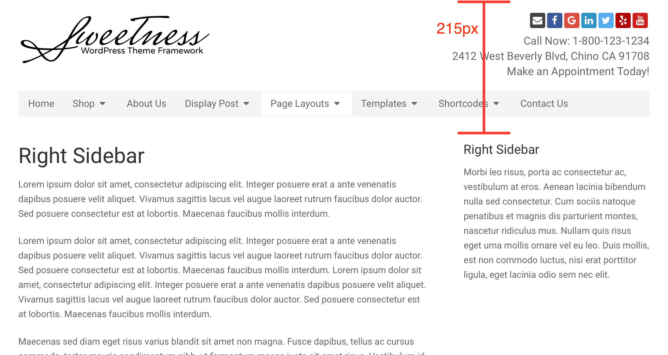
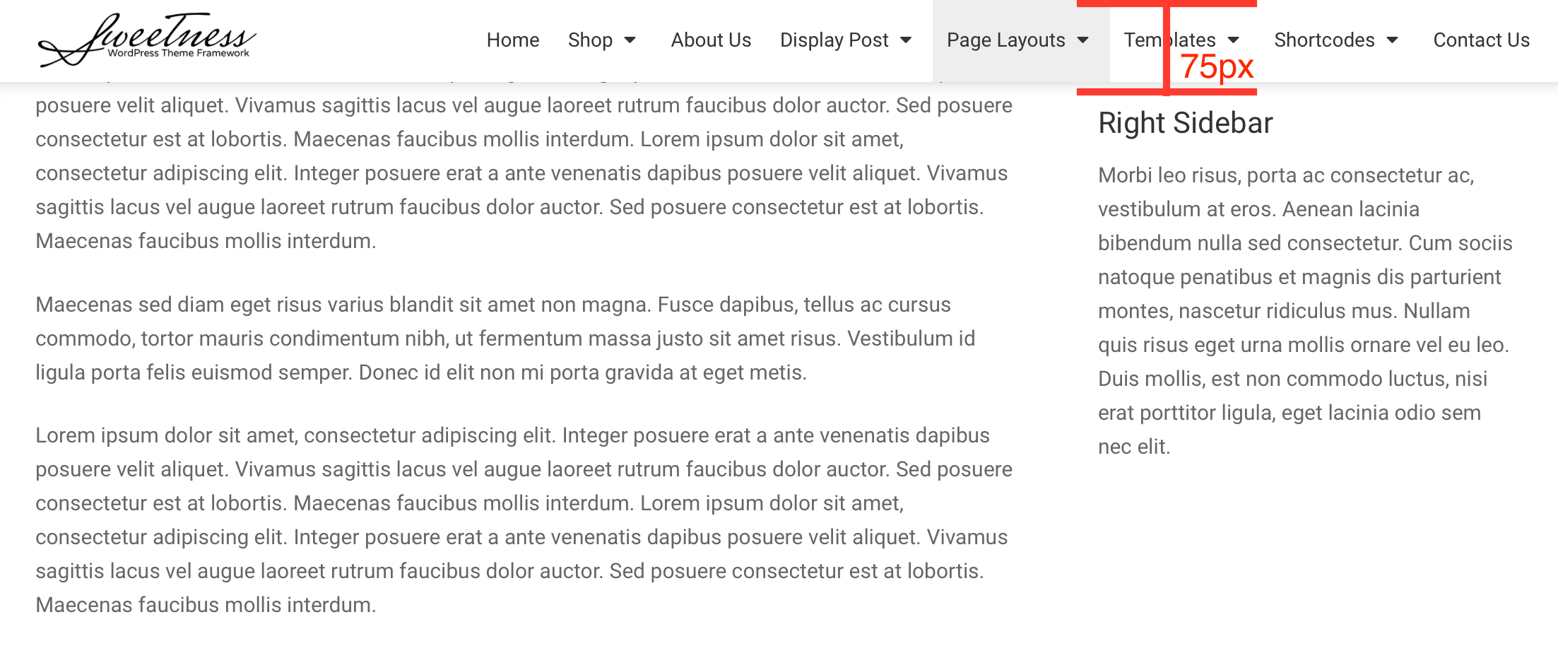
Top Position
By default, your top position is going to be 0, but most likely this isn’t going to look as nice as giving a little extra space. This space can vary, though, depending on if you’ve got the sticky menu enabled or not, from your theme options page.
In my example here, I’ve got the sticky menu enabled. So I used my web browser’s developer inspector to determine the sticky menu is 60px in height. And then I added 15px more for some extra space below that, and to have a nice round number.
So, we end up with 75px for our top position.
Calculate Your Offset
Now that we know the distance and top position, we need to do some basic math. We need to determine the offset of our sticky sidebar. Basically, this offset is the point where we want the sidebar to stick, and we can determine it with the following formula:
Distance - Top Position = Offset
So if I plug in the values for my specific setup into this formula, I get 140px for my offset.
215px - 75px = 140px
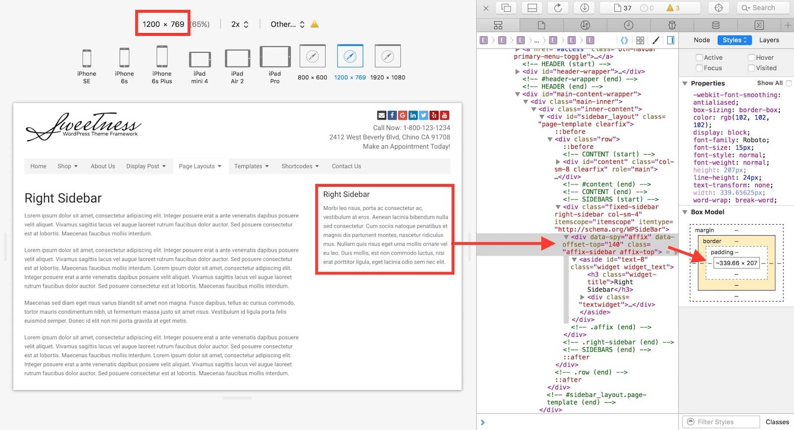
Sidebar Width
As described in Bootstrap docs, we must designate a specific width for the fixed position elements. So, we’ll need to determine the width of our sidebar.
In the case of our theme, we’re only going to be adding this feature to desktop viewports. So, we’ll need to determine the width of widgets for both large desktops and small desktops.
First, we need to figure out the width of the sidebar when the viewport is 1200px or above (large desktops). In the screenshot below, I’ve done this in my Safari inspector. Rounding up to the nearest pixel, I’ve come up with 340px
Then, we need to do the same thing, for when the viewport is anywhere between 992px and 1199px (small desktops). So, again I do this in Safari's inspector, and I get 294px, after rounding up to the nearest pixel.
Implementation: Adding the Code
After our prep work, I’ve determined the following values for my setup:
- Distance:
215px - Top Position:
75px - Offset:
140px - Sidebar Width (large desktops):
340px - Sidebar Width (small desktops):
294px
Add the HTML
In order to use the Bootstrap Affix data attributes, we need to sneak in some HTML markup, to wrap our sidebar. We’ll utilize the theme’s action hooks, bne_sidebar_before and bne_sidebar_after. You’ll add the following to your child theme’s functions.php.
In the above code, notice I’m using data-offset-top="140". That value will be the offset you calculated earlier.
Add the CSS
Next, you’ll need to add some basic styling for the sidebar to accommodate Bootstrap’s affix feature. Add the following CSS to your child theme’s style.css, replacing the top position and widget width values with your own.