Logos is a powerful and responsive WordPress plugin that provides an easy and intuitive way to display showcase clients, companies, profiles, projects, and portfolios. Display the logos using a grid or carousel slider including the option to display a single logo within your content.
Installation
You can install BNE Logos two ways, either FTP to your server and upload the bne-logos folder to /wp-content/plugins/ OR you can install/upload the zip file, “bne-logos.zip” included within the main file you downloaded.
Uploading/Installing via WordPress:
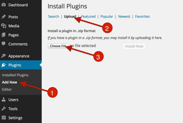
- Go To Plugins > Add New
- Click on Upload
- Click “Choose File” and drag “bne-logos.zip” (This file may be inside your downloaded zip file).
- Active BNE Logos
- After you have installed and activated BNE Logos, a new option will be added under the admin menu labelled "Logos".
Adding a Logo
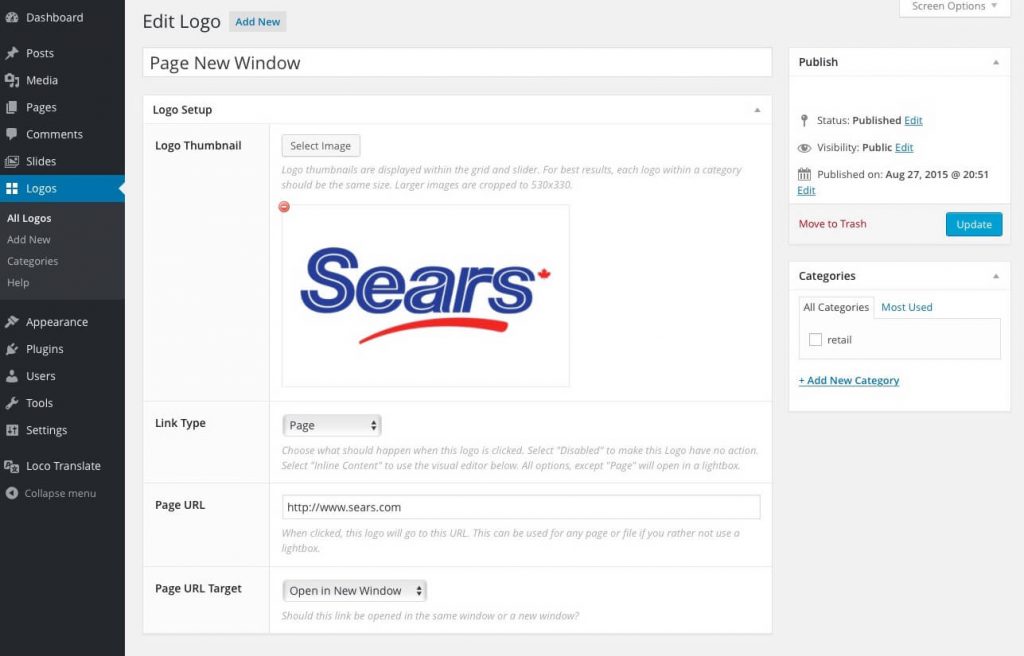
Go to the new Admin menu item labeled, "Logos" and select Add New from the drop down menu. From here it's pretty simple. Each logo can include a click action that can either display additional content such as text and videos or they can link to another page.
- Logo Thumbnail – The logo thumbnail is what is displayed in the grid or slider. All logos should use the same size image so that the grid and carousel slider displays evenly. We recommend 530x330, but you can really use any size smaller.
- Link Type - This controls what happens when the logo is clicked. Options include, nothing (disabled, page, inline content, video, or an iframe. After selecting a type, an additional field will show below for that type.
Logo Types
Each logo has the option to link to a page or lightbox content as listed below.
- Disabled: No action will be happen when clicking on the logo.
- Page: Will link to any page (internal and external) using a URL. You can also use this to link to a file such as a PDF.
- Iframe: Will display content within an iframe using a lightbox such as Google Maps, and PDF files.
- Image: Will display a chosen full size image using a lightbox.
- Inline Content: Will display content added to the visual/text editor in a lightbox.
- Video: Will display a video using the WP oEmbed service in a lightbox.
If your lightbox content is not working, make sure that you have entered the correct URL/content for the lightbox.
Logo Thumbnails (featured images)
You can technically use any size smaller than the recommended crop of 530x330. What is important is that every logo within the display is the same size for correct grid arrangement.
If you are using different sizes for different areas, setup categories that best fit your needs for each size group. You can also change the default crop size that is used by including crop="my_size" within the shortcode. Replace "my_crop" with the crop slug needed. For example: thumbnail, medium, full, etc.
Note: If you are using different sizes within a single shortcode, the width of each column is based on the largest logo used. Another reason to make sure all logos are the same size for each group.
How to use the Shortcode
Logos are displayed using a shortcode [logos] and can be added to any post page content area. Below are all of the available options that can be added to the shortcode to alter the default settings.
| Argument | Default | Options | Description |
|---|---|---|---|
| title | false | true or false | Display the logo title (post title) below the logo. |
| post | -1 | Any numerical value. | The max number of logos to display. use "-1" to display ALL logos. |
| id | Any numerical value. | Display only a single logo based on it's post ID. | |
| category | The category name or slug. | Displays only a selected category of Logos. | |
| order | ASC | ASC or DESC | Should logos go in an ascending or descending order based on the "orderby" setting below. |
| orderby | name | name, date, rand, etc. | The arrangement the logos are displayed in based on the "order" direction above. |
| display | grid | grid or slider | Display your logos using a traditional grid or a rotating slider. |
| columns | 5 | 2, 3, 4, 5, or 6 | The number of columns in each row within a grid and slider. |
| frame | 2 | 1, 2, or 3 | Wraps each logo in a basic styled frame. #1 = no frame, #2 = border only, #3 = white background with border and shadow. |
| grayscale | true | true or false | Modern browser only. Will turn a fully colored image to grayscale. When hovered, the image will revert to its full color. |
| crop | bne_logos_thumb_size | Any available crop slug | All logos in this shortcode will use the crop size specified here. Depending on the crop used, and if using smaller images than what the crop provides, may result in different image sizes within the grid. |
| arrows | true | true or false | Slider Display only. Show or hide the left and right arrow navigation. |
| dots | true | true or false | Slider Display only. Show or hide the bottom pagination. |
| perslide | 1, 2, 3, 4, 5, or 6 | Slider Display only. This represents the number of logos that will rotate each time. The default setting is calculated by taking the number of columns and dividing by 2. If the division is a fraction it round up next whole integer. | |
| speed | 900 | Any numerical number in milliseconds. | Slider Display only. The speed of which each slide group occurs. If using continuous below, this will control the overall speed of rotation. |
| continuous | false | true or false | Slider Display only. Automatically starts and continues without stopping. This will override the perslide, dots, and arrows options above. Use the speed option above to adjust the rotation time. |
| width | 100% | Numerical value with px or % | Sets a max-width to the logo wrapper. Useful, if you want to use a single logo or alignment around content. |
| class | Includes custom classes in the logo wrapper. Useful if you want to customize the CSS or add theme class alignments. |
Example: [logos display="grid" columns="4" category="retail"]
The above example will display the logos in a grid, 4 columns per row, and only those that are part of the "retail" category.